

Cloud Paper Brand Exploration

Brand exploration and UX audit for Cloud Paper’s customer- and business-facing web presence.
Client: Cloud Paper
Deliverables: Mobile UI, Style Guide, UX Audit
Timeline: 4 Weeks
Tools: Sketch, Principle, Photoshop, Invision
Gallery
Hi-Fidelity Mockups

Experience Map

Style Guide


Project Overview
Overview
Cloud Paper is a startup that sells bamboo toilet paper via a subscription box model. We were tasked with investigating the market and developing a design direction that would better emphasize their unique selling points as well as help convince the members of their target audience to commit to a purchase.
I was part of a team of three, each of whom focused on different parts of the process. I developed a website overhaul that integrates their existing brand as well as a full UI/Style guide. I also produced several ancillary assets, such as a competitive analysis matrix, a persona overview, and a persona journey map.
Understanding the Market
To begin the process of understanding Cloud Paper’s market placement, we gathered a list of competitors and made notes of their UI and brand patterns, aggregating our results into a spreadsheet for easy reference. Additionally, we created a competitive matrix to better visualize the market ecosystem; this allowed us to place where Cloud Paper sat in their current iteration and to track where they wanted to end up on the matrix.

We determined that Cloud Paper is a niche product with an advantage in their strength of vision and ability to execute to their business-facing clients. In talks with stakeholders, we concluded that their ideal position on the grid was not quite mainstream or a total industry leader, but with a more complete vision and a more robust customer-facing element.
Evaluating Usability
As part of our research, we gathered info about Cloud Paper’s target demographics from the stakeholders. With that information, we developed a user persona that we could use to frame our user testing and adjust our questions accordingly.
Once we developed a serviceable user persona, we set out evaluating the site’s usability though that lens. We conducted 3 rounds of user testing, with each round involving between 7 and 10 participants. We individually guided them through the existing website, asking them to think aloud and convey their thoughts about what worked and what didn’t. Once the testing was complete, we consolidated our findings and developed a journey map that identified key areas of opportunity:

Visual Exploration
Moodboards
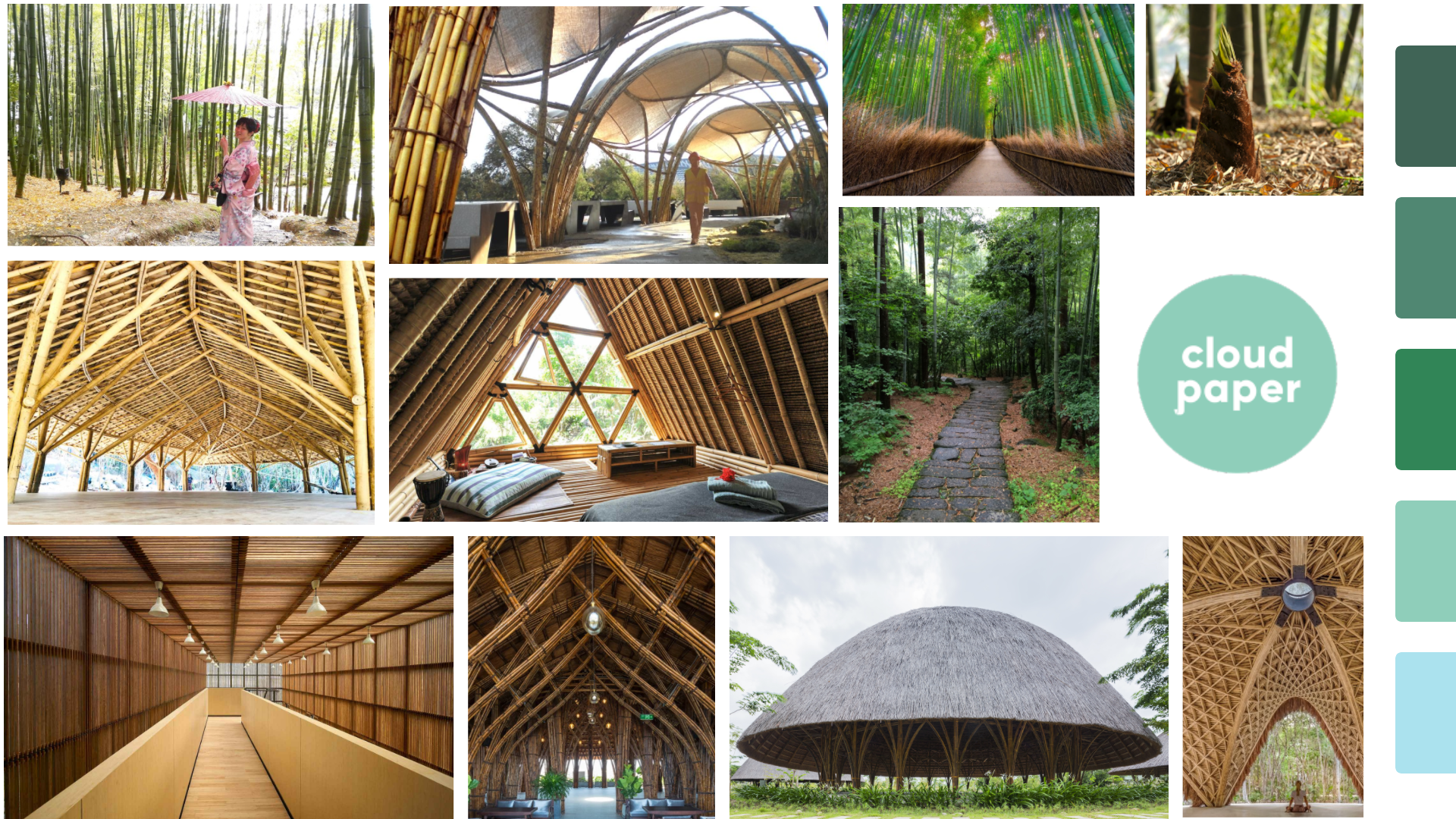
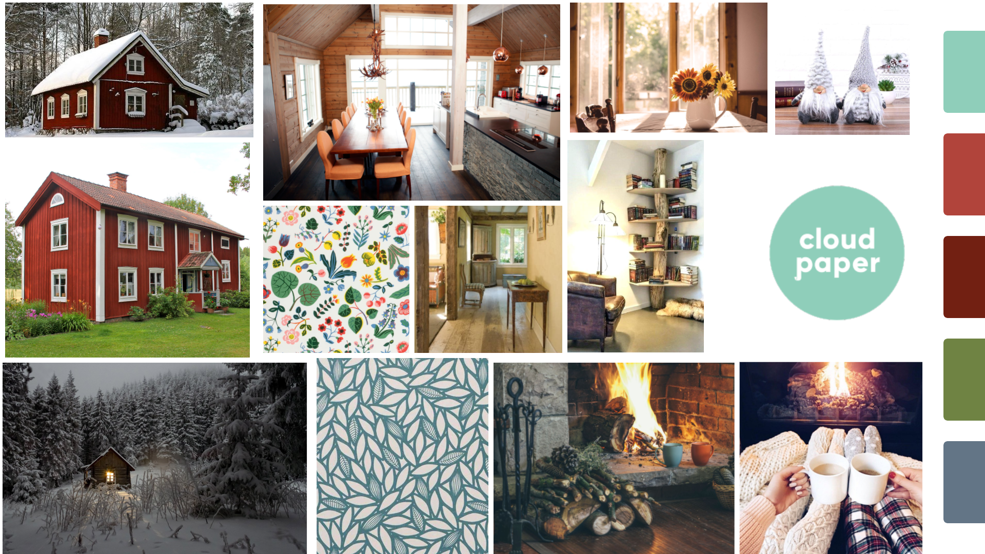
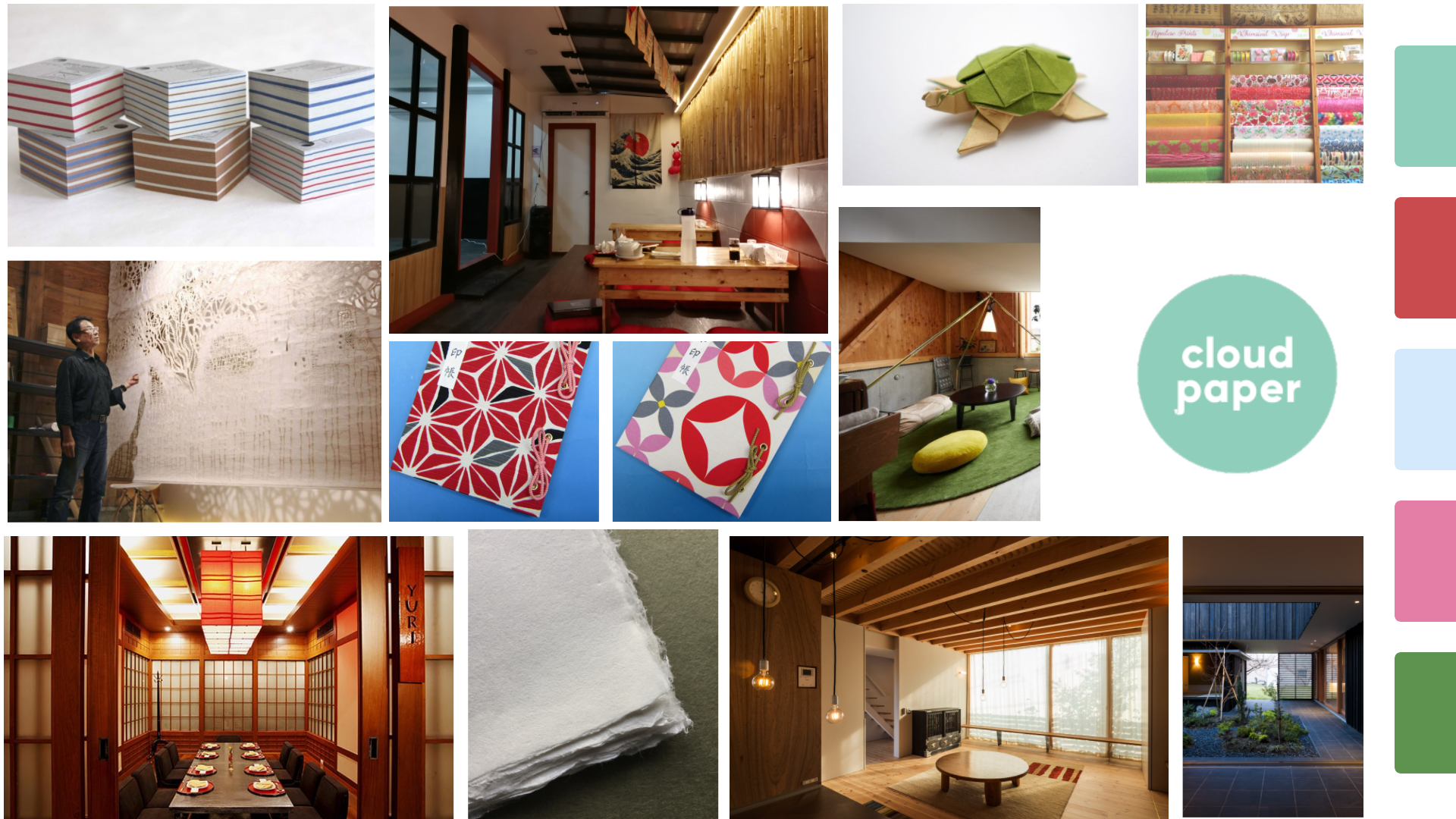
Moodboards are a method of gathering images, colors, and text that combine together to create an early sense of how a design resonates emotionally with an onlooker. I created three moodboards in my explorations, each meant to capture a different aspect of the bamboo/paper aesthetic. Each moodboard also includes a color scheme that I generated around Cloud Paper’s existing teal color.
Style Tile
Style tiles take the emotional vibes projected from the moodboards and distill them further into a more tangible design, often times including potential UI elements, iconography, and sample screens. I created this style tile from the “bamboo” moodboard, as it received the most positive response from user testing.

Color Ideation
My team created mockups with divergent color schemes to test how people would react to the addition of these colors to the site’s existing palette. We discovered that adding a subtle blue and differing shades of green elicited the most positive response.


Final Results
Screen Mockups
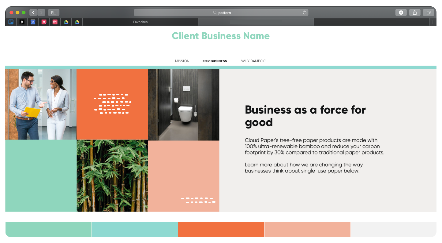
Finally, with a stylistic direction and color scheme nailed down, I designed a mockup of Cloud Paper’s potential new homepage. Significant additions include on-brand stock images (such as product shots and bamboo shoots), a more intelligently-designed header bar that informs the user of their location on the site at all times, and several copy text updates to better inform the user about the product and its mission.

I also created a mockup for a new contact page, as the existing site’s contact page would take them away from the website. Having an embedded contact form encourages the user to engage with the site more and can potentially turn an uninterested user into a new customer.

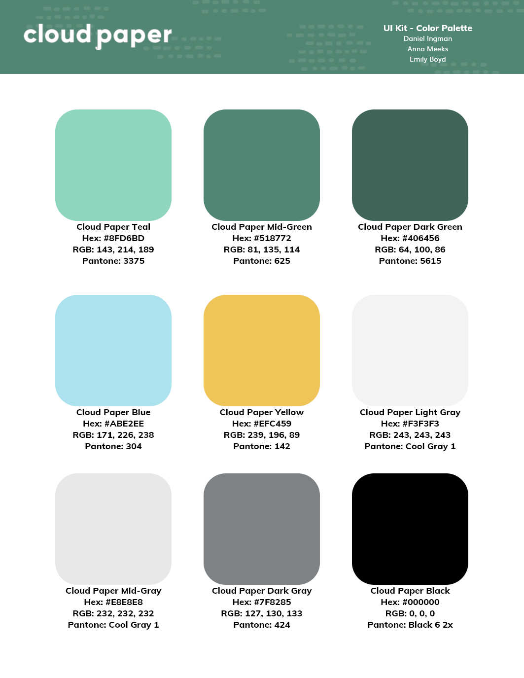
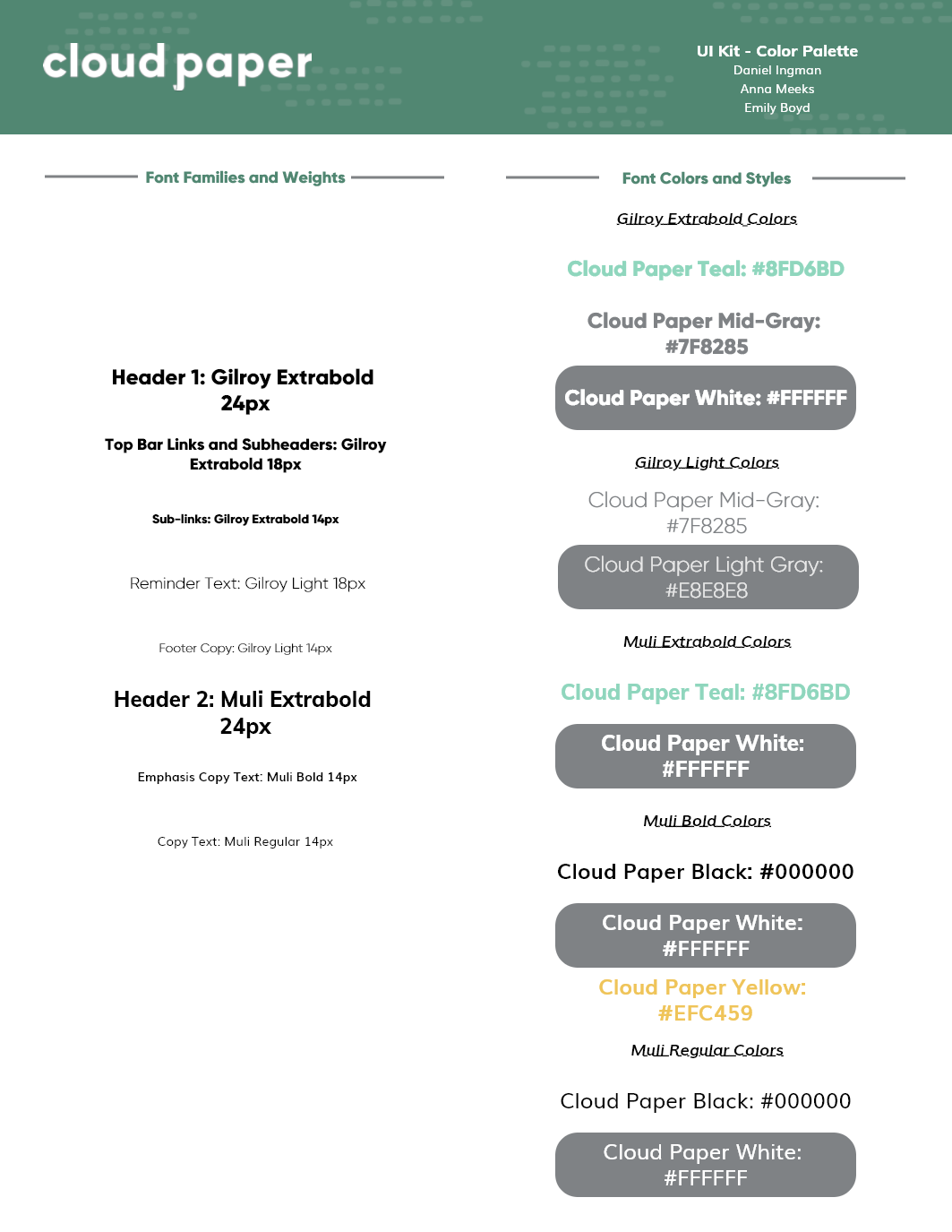
UI Kit and Style Guide
Based on the final design of the site rebrand, I compiled essential elements into a UI/Style guide that could be easily referenced by future designers and developers.


Microinteractions
In addition to designing mockups, I used Principle to design and animate several microinteractions that could be integrated seamlessly into the site to enhance its overall feel.


Retrospective
This was an incredibly valuable phase of my career. Being able to create and present designs to a real client while still in the learning stage was scary but it gave me the confidence I needed to keep growing and develop my style. I can’t wait for the next client.
Key Takeaways:
Establish goals early. This project was a new scenario because though we were actual work for a real client we still had a list of deliverables from Flatiron that we were expected to deliver. While we were able to work it out in the end, it definitely created some confusion that could have been avoided by creating a list of expected deliverables up front rather than doing non-essential work just because it says to.
Stay in communication. Obviously you don’t want to spam the client with every little bit of progress but establishing a workflow that accounts for periodic check-ins and sign-offs will do wonders for your client-designer relationship.
Be open-minded! Design work allows you to explore all kinds of industries, especially ones that you may not have expected to be interested in. It was great fun to research the world of eco-friendly paper products and see how they conduct business and establish their brands.
Next Steps:
With more time I would have created a fully-featured interactive site prototype. I also would have coordinated with my teammates to make sure that all of our assets stay on-brand as much as possible. We all have our own styles and tend to deviate slightly.