

Voluntopia

How do we incentivize those who have had a positive volunteering experience with a service project to recruit and prepare others for new volunteering opportunities?
Deliverables: Mobile UI, Branding
Timeline: 5 Weeks
Tools: Sketch, Principle, Photoshop, Invision
Gallery
Any of the images below can be view in a larger format by clicking on them.
Hi-Fidelity Screens


Logo and Branding


Micro-interactions


Case Study
Overview
Voluntopia is a mock project designed by DESIGNATION/Flatiron School to answer the question: “How do we incentivize those who have had a positive volunteering experience with a service project to recruit and prepare others for new volunteering opportunities?” It is an app that aggregates micro-volunteering opportunities and presents them to the user via a fun, game-like experience. The user completes tasks that have a real-world effect in order to progress in-game. The micro-volunteering opportunities are simple and require a very small time commitment in order to make a difference.
I was part of a team of three UI designers, each of whom would be working to develop a brand identity for the product. We did all of the research as a team but then split off and took the concept and design of the app in our own direction.
Over the course of this five week project, I learned best practices and methods for user testing, became much more comfortable with putting my designs in front of other people, and leveled up my skills with industry-standard tools.
Initial Exploration
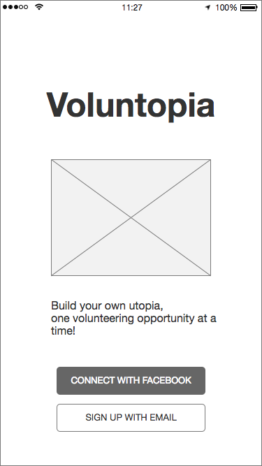
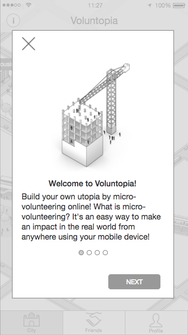
When we were handed the pitch, we immediately spent time doing initial brainstorms and mind-mapping to brainstorm visual treatments. At this point, nothing was off the table and we were simply throwing anything at the wall and seeing what stuck. The wireframes that we were provided (created by a previous UX team at Flatiron) formed the basis for our explorations but eventually our designs shifted thematically.
Evaluating Usability
The wireframes we were given were perfectly serviceable, but our team wanted to go the extra mile and identify areas of opportunity that we could fill with our designs. We recruited friends and family members as test subjects and evaluated their reactions to the wireframes, while also making note of their backgrounds and experience with volunteering. Once we had about 12 user test sessions done, we created an affinity diagram that grouped common critiques together. Based on that information, our teammate Anna created an opportunity map that would allow us to prioritize design elements that needed the most attention.

Identifying Competitors
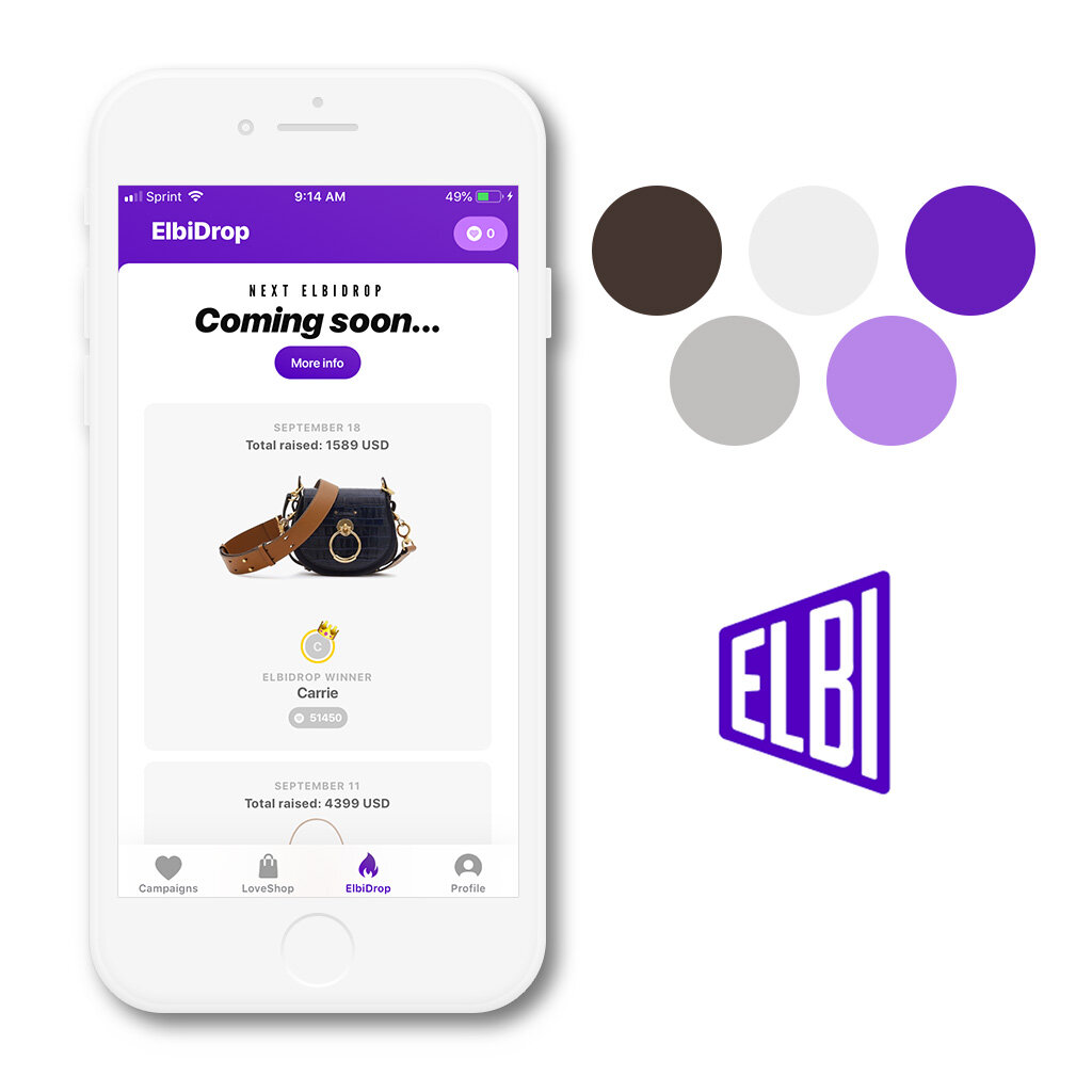
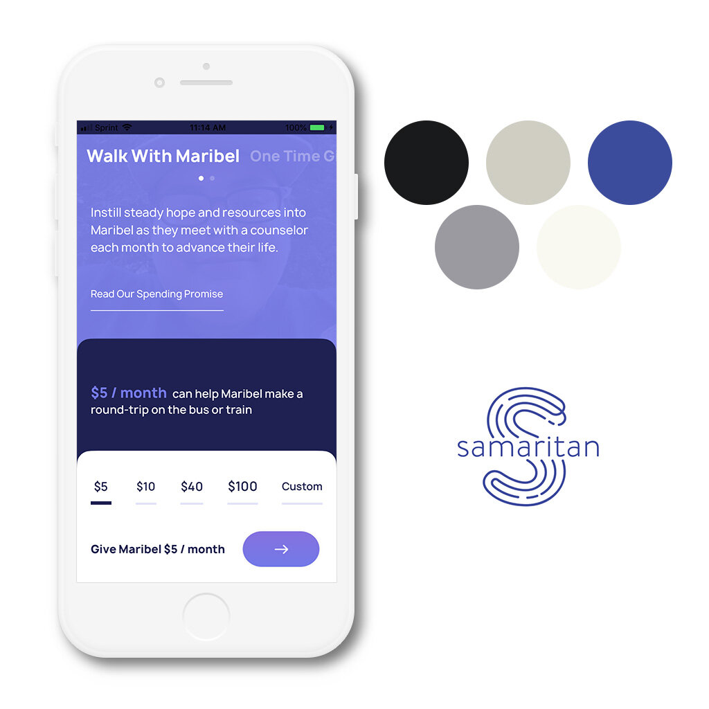
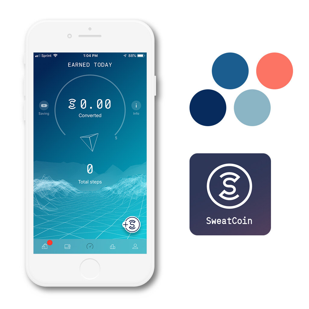
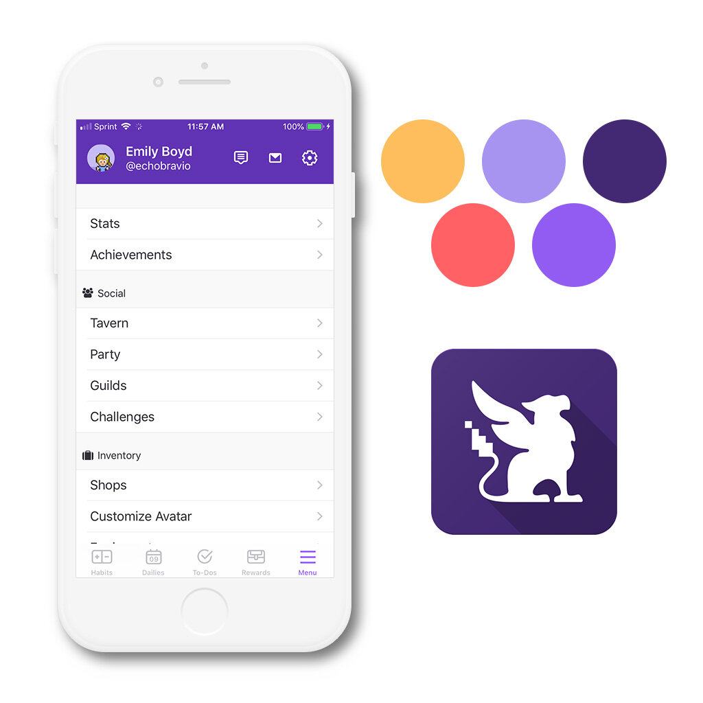
Our team compiled a list of direct and indirect competitors and analyzed their brand identities, making notes of colors, fonts, iconography, and other components that we would have to take into account when creating our own designs. We examined apps that focused on charitable giving (such as Elbi and Samaritan) and apps that gamified otherwise mundane processes (such as Habitica and Sweatcoin) and compiled our findings into a spreadsheet for easy comparison.
In examining these competitors we found that it was important for an app in this market to be bright and engaging while not feeling too overwhelming. Most of these apps used shades of blue, purple, orange, and red as their primary and secondary colors on top of a primarily white or light grey base.
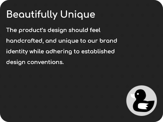
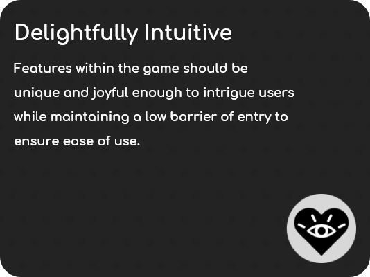
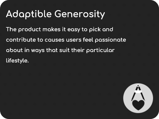
Design Principles
After conducting brand research, we converged do do a word-mapping exercise in order to distill our findings into actionable design principles. We wanted to develop a set of tangible guidelines that would guide our visual explorations going forward. (credit to my teammate Emily Boyd for designing the icons for each principle)
Visual Exploration
After designing a series of early moodboards to coalesce my thoughts into more concrete visuals, I developed a series of style tiles that would help nail down a color scheme and design language. As I developed these moodboards I kept the brand principles in the forefront of my creative process.

My first style tile was a more modern, rounded direction. I chose a bright yellow and blue color scheme and a quirky dot pattern to differentiate this design from the majority of the competition and encourage interaction. Big, round buttons and round icons give this design an inviting vibe.

My second style tile evokes the feeling of a garden, with a green pattern reminiscent of a groomed lawn and featuring a watermelon red to contrast the green. The buttons and icons are rounded, but not drastically so. The design is modern, yet comfortable.


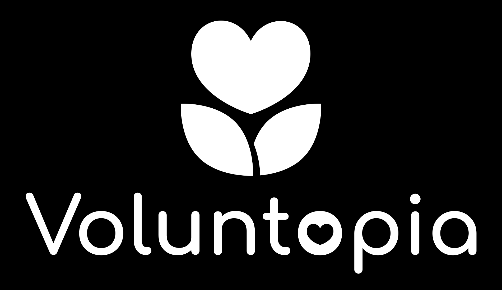
As I developed the above style tiles, I concurrently developed what would become the app’s final logo design. When I started initial explorations, I found myself drawn to logomarks involving the letter “V” as well as leaning towards game-themed elements (potion bottles, swords, hearts, etc) and natural elements (trees, flowers, leaves). As I explored more and settled on a stylistic theme, I chose a logo that resembled a heart-shaped flower.
The Home Stretch
After I finalized my style tiles, I opted to go with a combination of the two styles. I incorporated the dot pattern and the softer elements of the first style tile into the second, which allowed for some more texturing variety and create a simultaneously eco-friendly and people-friendly experience.
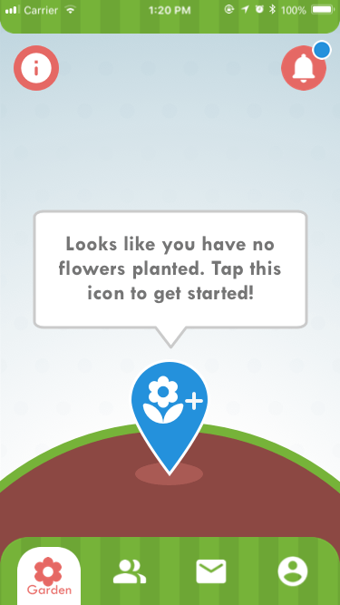
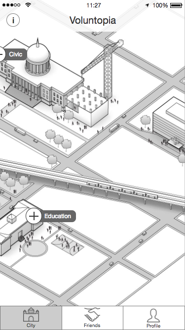
The biggest divergence was my decision to stray from the city-building concept and instead re-work Voluntopia as a game wherein players complete micro-volunteering tasks in order to plant and nurture their own personal garden.
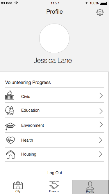
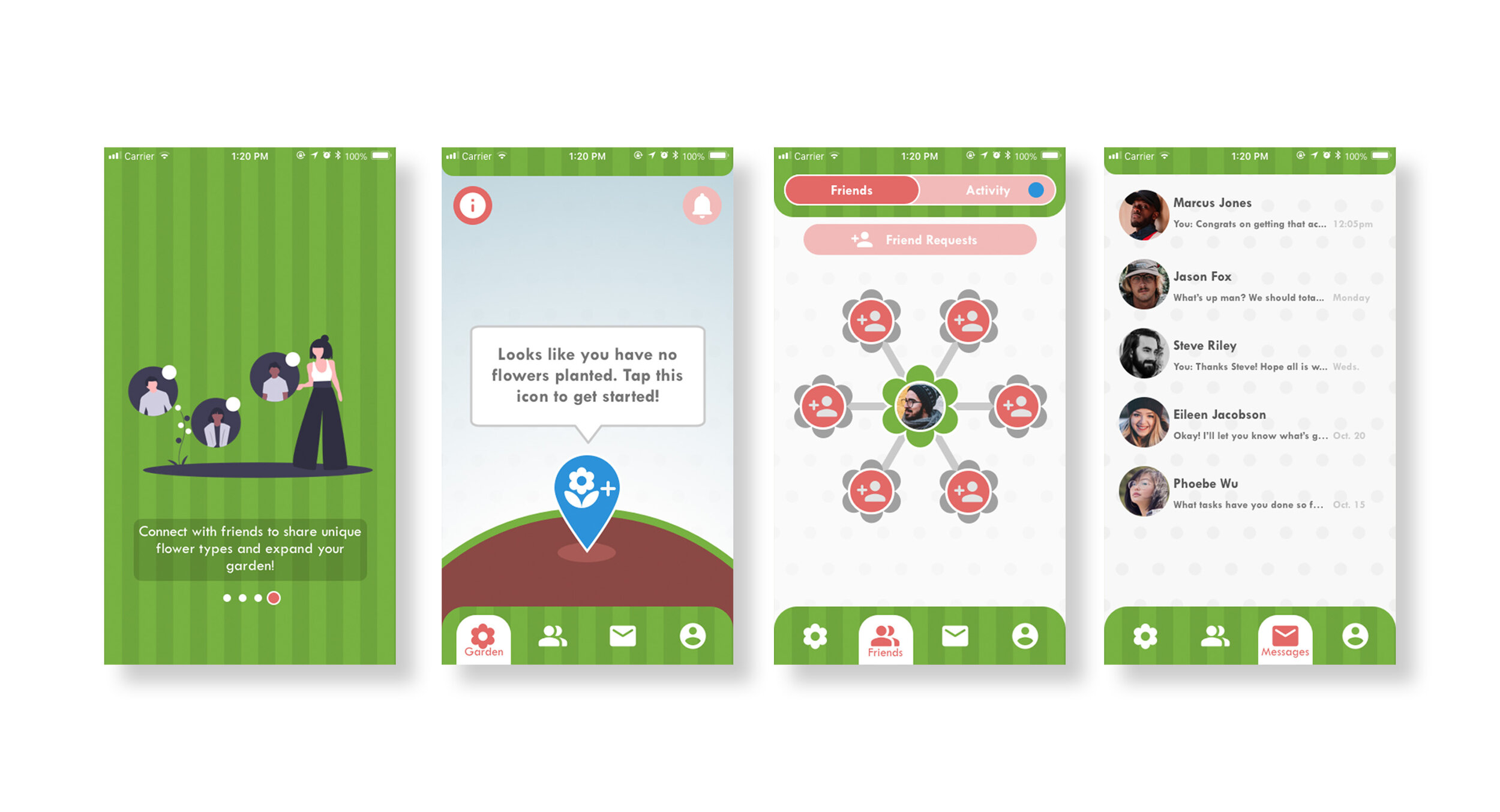
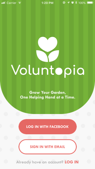
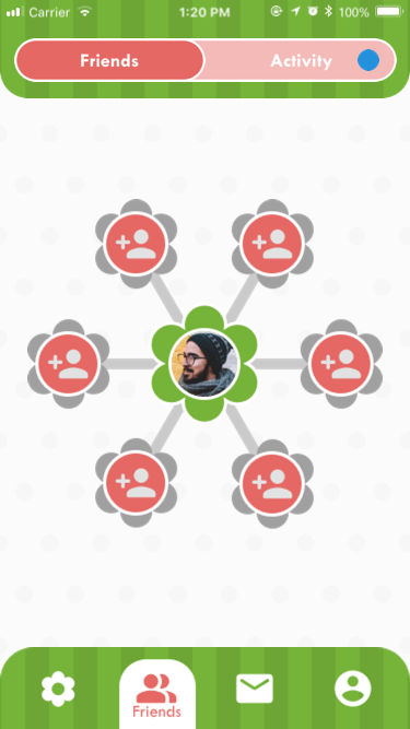
I created a full suite of screens that depicted a typical user flow, from login to the completion of their first micro-volunteering task. (Click on any of the below images to see a full-size version)


I also spent time animating three “hero” micro-interactions that the user would encounter during their use of the app. These were designed to be minimally intrusive, but delightful to experience.

I also created a style guide that compiled logo usage guidelines, color swatches, and typography into an easy reference package. (Click on any of the below images to see a full-size version)


Final Words
I learned an immense amount during this project. I was definitely out of my comfort zone on a lot of my designs and stylistic directions but user data was responding positively to them and it gave me the confidence to forge ahead.
The team structure for this project was strange, however. We spent the initial research and development phase in close contact, producing deliverables as a unit. However, when it came time to shift into style explorations we were expected to split up and deliver individual designs. I would have loved to work as a team on this part of the project. However, I was still able to push myself and stand up for my design decisions solo.
If I had extra time to work on this project, I would clean up the style guide and create a more streamlined, thorough, and easy-to-reference design system. It’s easy as a designer to have your own quirks and methods for keeping your designs consistent, but if someone else wants to emulate your designs you better make sure you have every possible variable marked down clearly. My style guide is still very much 1.0, but if I had an extra week I would like to polish it and reformat it.